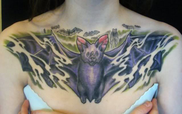
this is my most recent piece completely finished.
this one is by Brad Brown, an amazing artist. i plan on getting him to do a few more tattoos for me.
this is a link to his tattoo group on facebook if anyone else wants to see more of his work:
http://www.facebook.com/group.php?gid=142176326709&ref=ts
Pretty goddamn cute!
It looks cartoonish and very cute!
=D
props to u for getting it on such a painful spot!
cool tattoo! I was thinking about getting a bat chestpiece of my own a while back. I think I’m gonna roll with an owl chestpiece tho, I like how they are solitary and associated with wisdom and all that crap lol.
Let me preface this by saying that I don’t mean to be rude, but I don’t like it.
Obviously you are happy with the work and other’s seem to agree but I think it simply doesn’t look like it was well done. Of course I’m not a professional so I may be wrong about this.
To me, the big bat just looks “off” somehow. Maybe you wanted it this way but bats don’t have legs like that! They have very thin legs with tiny feet sort of going off to the sides. Just don’t feel like the proportions are right and also, it looks pretty flat. Again, if that’s what you wanted then forget what I said 😉
Also, I personally don’t like the background. May I ask why you chose that color? And then the small bats on the top, I don’t know, they just don’t look well done.
In my opinion you could have gotten a better piece with that idea.
Sorry, but that’s my 2 cent.
I agree with Jlin – still -as long as you like it !
Obviously you are happy with the work and other’s seem to agree but I think it simply doesn’t look like it was well done. Of course I’m not a professional so I may be wrong about this.
To me, the big bat just looks “off” somehow. Maybe you wanted it this way but bats don’t have legs like that! They have very thin legs with tiny feet sort of going off to the sides. Just don’t feel like the proportions are right and also, it looks pretty flat. Again, if that’s what you wanted then forget what I said 😉
Also, I personally don’t like the background. May I ask why you chose that color? And then the small bats on the top, I don’t know, they just don’t look well done.
In my opinion you could have gotten a better piece with that idea.
Sorry, but that’s my 2 cent.
I agree. The face of the bat looks way off. It doesn’t pop the way a piece of that size should. It looks like ok work but it’s nothing special. If you like it that’s all that matters but it’s not something that I am wowed by at all.
it is what i wanted obviously.
i wanted a cartoony, happy looking ghost bat chest piece. purple and green are my two favourite colours so that’s why i chose them. the green is a little lighter in person and i’ve since gotten some more definition lines in it.
i don’t expect everyone to like it, obviously.
Ha! I knew it was cartoonish!
As stated before already, cuuute. XD
It’s okay.
Like others have said, you could have done more with this idea.
I personally think that’s a sick piece of Ink.
I really like it
Cheers
Marcus
I like this, reminds me of my bros spooky themed sleeve
thanks everyone 🙂
You must be logged in to create new topics.

