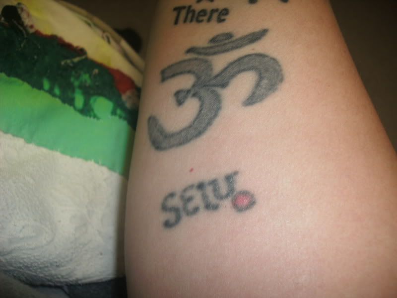
BEFORE:

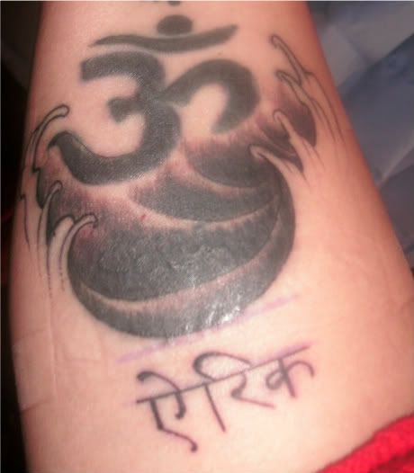
AFTER:

The wording is Sanskrit: It translates as ERIC, which is dedicated to my best friend Eric that died.
looks better but the symbol could have been cleaned up some more and have a crisper outline around it
looks better but you really need to find a better artist.
The outline on the symbol bottom left is pretty bad man. A lot of the lines in the finger waves are pretty wonky too.
A better artist could salvage it pretty well though.
This is a better artist. This is a totally different artist than before. This is an artist that comes highly recommended from another state that I worked with on the design and met up with at The Phunk and Ink Tattoo and Music festival. He does incredible work. Look up Voodoo Tattoos, Bay City, Michigan, artist Paul Gomez…And I’m gonna have the finger waves colored in like fire at a later date with another Sanskrit symbol added. The lettering is Sanskrit and it means Eric, which is my friend that died.
Wow his stuff is all over the place. There are some that I like and are real good and some that are just crap.
http://www.myspace.com/paulybagadonuts273
When I googled him the first one was a facebook page with your tattoo right under a awesome piece done by Kirk Alley.
I swear ya’ll are just on here to put people down!!!
That is one the best tattoo that I have ever seen. The artist did a great job he was on his A game when he did that tattoo. Congrats be happy and smile.
It doesn’t matter what I post, you have something to say…How about skip anything I put on here and move on to spread joy to someone else! I’m tired of this crap from you in particular!!!
I must admit I did re check the original photo to see if the symbol had been re done as it looks very washed out and not well executed as you would expect particularly as it is fresh.
Unfortunately Buttwheat is right the artist is not the best looking at his portfolio so are alright but some are not look at the 1st one of Yoda that will look like Yoda for a year and then a blob of dull colour.
Go see another artist get them to power lines the work and re shade. Unfortunately negative feedback hurts when its not as positive as hoped for.
Look at your tattoo, bottom left of the symbol, are you seriously suggesting to us that that is the product of a great artist?
Now look at the finger waves, bottom right in particular, the spaces between the waves fluctuate and is uneven.
No one’s trying to put you down or be an asshole for the sake of being an asshole. It’s just not a very well done tattoo.
I have been on many other forums(not just for tattoos) and normally I would be on your side but you have to understand that people have to be blunt about tattoos or else you will walk around thinking you have a nice tattoo when you really don’t, and on top of that how else will you learn to pick out a good artist for your next tattoo if you don’t even know whats wrong with your original tattoo.
I have to disagree and I’m sure all of his customers who go back to him in various states would disagree!!
I know what’s wrong with my original tattoo. It was done by a kid and this is now 8-10 yrs later that I had it redone.
By the way, not everyone is looking for magazine cover type tattoos. I have since washed the tattoo since that photo when I took it off and it looks wonderful and I’m pleased. I will get more done at a later date…
man youre such a whiny lil bitch. you post your tattoos (which arent good at all) and when people say they dont like them you start crying. if you dont want to hear HONEST opinions about your tattoos dont post them on a PUBLIC forum. this forum is more forgiving than other forums i am on and if you posted them elsewhere, your tattoos would be blasted a lot harder on the other sites. if you like them thats great, more power to you, but just be prepared for comments good or bad.
Then you’re bordering on delusional. You’ve got people here with very high quality tattoos and art, who clearly know what they’re talking about, saying it is not a very well done tattoo and you’re still choosing to disagree with them.
It’s not about magazine quality, it’s about an artist who can do linework without it looking like they had a sneezing fit midway. It doesn’t have to be a well done tattoo for you to like it, as you’ve already shown, but that doesn’t dispute the fact that it’s still a badly done tattoo.
- The topic ‘Om redo and Cover-Up with Sanskrit’ is closed to new replies.

