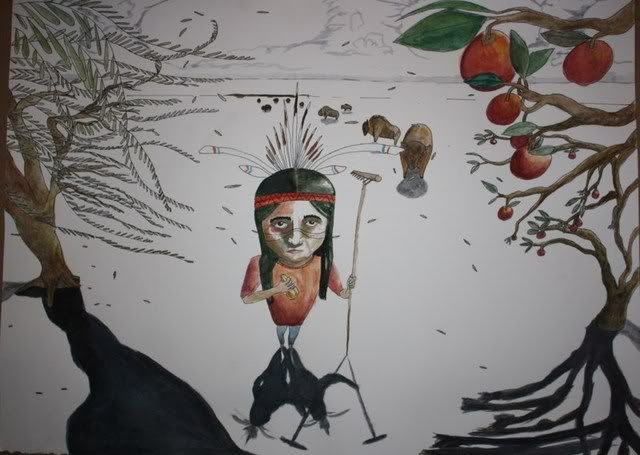
this is what im planning to get on my chest. Its an illustration i did i’m taking it into my artist and letting him adjust it into a full chest peice but i want it to mainly be what i have done. I’d love to hear some feed back and ideas to improve it.
Well, IMO it’s very poorly drawn, so I’d say to improve it get someone to draw it that can draw.
its a blurry picture of a large painting so there is a lot you cant see. I got very lazy with the picture. I’m more of a child like illustrator and thats a look i was going for. I’m compleatly happy with it and i can draw I’m actually in a top art colleges in the country and was offered a substansial amount by alot of art schools. this wasnt going for realism. and I’m letting my artist run with it and craft it into a tattoo. I know my drawing skills are fine and I like the peice I want to know if the comosition will work to add or take away anything. I just looked at the picture again and thats really really bad. Maybe I’ll take a new one with some much better lighting.
Ah! Very good. Then it is as it should be 🙂
That begs the question, however, what you are actually asking about. If you like it as it is, what precisely do you need advice on?
Go for it but allow the artist correct stuff like the shadows. Is this from a planet with many suns?
haha the shadows were just a composition thing i dont really like how that worked out I wanted the trees shadows to come down in towards him so i think that will be changed to 1 shadow each. And I’m happy with it i just want to know how this would work more as a chest peice and if there is somthing that should be added or taken away adjustments to the image that is already there.
Hmm.. then pick a sun and stay with one shadow.
Personally, I think there’s way too much white space in the middle, and I would like to see something there, even if it’s just tufts of grass here and there.
i think it would make a better back piece than chest piece………too much anatomy to work around on the chest….
I agree with the sun I should have done only one but whats done is done Ill tell my artist how id like that adjusted. And I already have a different idea for my back and I would like this one to go from the bottom of my collarbones to below my sternum
i like it.
You must be logged in to create new topics.

