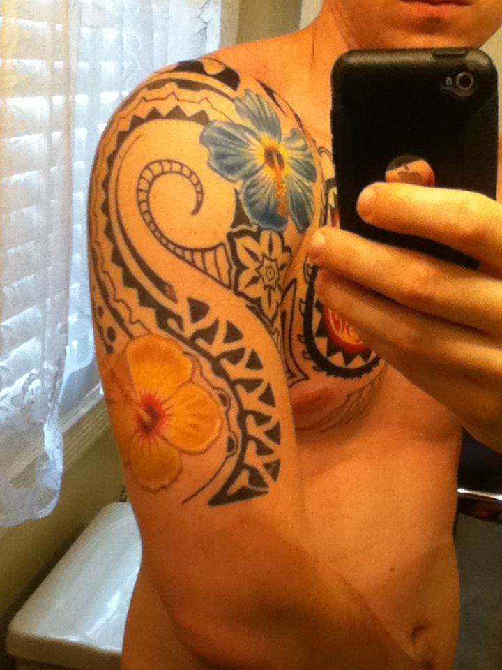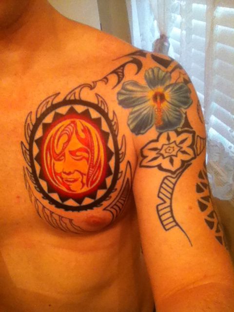

All that is left is coloring the chest and more tattoo work on the inner bicep, then maybe a little more on the back shoulder.
I am also thinking of having him add some ink around the upper inside of my chest to kind of in case the sun more.
Anyway let me know what you all think. Thanks
I’m somehow drawn to that sun. It reminds me a bit about that raging moon from space mountain. I like it.
Not that big of a fan of the unlined flowers… Looks a bit off. Would’ve been better if they had black lines in my opinion.
Also hope the artist has a good idea for that spiral on your shoulder, because from here it looks like he’s out of ideas.
To me it looks as if still needs a lot of work yet. I like Polynesian tattoos yours looks to open to me and needs a bunch more filler patterns. I like the idea it looks pretty cool though.
@buttwheat 127132 wrote:
To me it looks as if still needs a lot of work yet. I like Polynesian tattoos yours looks to open to me and needs a bunch more filler patterns. I like the idea it looks pretty cool though.
I get what your saying, mind suggesting where you think it needs filler patterns?

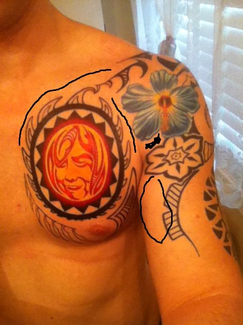
If you look at the pic I used black lines to show where maybe I would like some more, Like I said before the under arm will be done in a few weeks. And I am thinking upper chest needs some more work to kind of enclose the sun like at the bottom of my chest. Between the flower and the sun is what I am not sure what to do with.
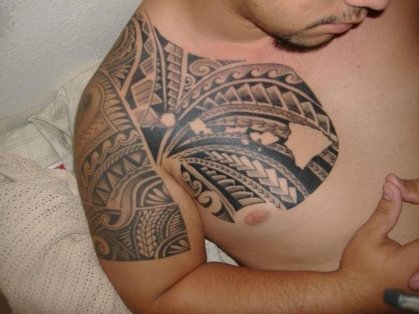
Everywhere where you said plus more look how tight the tattoos are compared to yours.


I see what you mean, those are more traditional though and I wanted mine to not be so traditional in the sense. Which is why I added colored flowers and sun. But other than where I highlighted I dont really see where else there is any open space to add anything. So please by all means point something out of you see something I am missing.
You can just run more patterns up to the flower as if the flower was laid upon it.
I like the flowers, but you need something to tie them into the mix.
My wife wanted something to dress up her Scottish Thistle and this is what we got.
The thistle was existing and the Celtic dragon was added by Anthony Zamora. I was impressed by him literally joining the two together.
@BertNaked 127124 wrote:
I’m somehow drawn to that sun. It reminds me a bit about that raging moon from space mountain. I like it.
Not that big of a fan of the unlined flowers… Looks a bit off. Would’ve been better if they had black lines in my opinion.
Also hope the artist has a good idea for that spiral on your shoulder, because from here it looks like he’s out of ideas.
Interesting. I like the hibiscus, but hate that sun. Don’t know why, but I just don’t like it. Maybe if the waves/rays stuff around the really thick lines was bolded up a bit?
Buttwheat is right. It needs way more design in there. For example there is way too much skin showing all through the spiral. Below the black flower there is another spot that should be tightened up. Plus the areas that you have pointed out. I know you are going for “inspired by Polynesian” rather than the traditional style, but I think you need to use a lot more black ink.
You have gotten me curious, though, to see how it all turns out in the end.
@Call_me_Lola 127150 wrote:
Interesting. I hate that sun. Don’t know why, but I just don’t like it.
Are you afraid of garlic?
How about wooden stakes?
@Sam-I-Am 127152 wrote:
Are you afraid of garlic?
How about wooden stakes?
That could be the problem!! My brother did refer to me as Dracula just this afternoon. The sun has finally come out up here and it looks like summer may be starting, but I’m hiding indoors due to fresh ink.
Or resentment that due to my bad timing I can now only venture out after dark. 😉
I had another look and really can’t pinpoint anything wrong with the design of the sun, and it looks like it was tattooed well. I think maybe it is the wimpy black next to the really solid black that is bothering me. ??? Or maybe it is just not my cup of tequila. (Oops, cup of TEA. Easy mistake on Cinco de Mayo.)
What I found interesting was that BertNaked liked the sun but not the flowers and for me it was the reverse. Just different tastes I guess.
I don’t like the sun either. The flowers show some really good talent, however it is lacking in the sun.
(Some of my best accomplishments were executed in the dark)
I actually love the sun, I had my artist use a picture of my daughter and turn it into a surreal polynesian themed sun. As for the spiral that part doesn’t bother me. I don’t want the whole thing to be a big cluster of design and like the open-ness of it throughout my arm. Plus once the underarm is done I think it will look much better. My only concern on what I want added to is the area between the blue flower and the sun, then the upper top portion of my chest. I am not sure what kind of design to go with that will look good. Also the areas on my chest that look like they needed colored still they do, its no completely done.
@Sam-I-Am 127190 wrote:
Keep us posted with many pictures!
I will for sure, I have some ideas for some filler work but does anyone have any suggestions for the space between the sun and blue flower? There isn’t much room there and I can’t think of any ideas that would work really
You must be logged in to create new topics.

