I have two black and grey tattoos on my upper arms. One has a bit of red in it, but that’s it.
(fresh)
(healed)
Now, I want to get quarter sleeves. Theres a tattoo I’d want in color that I’d maybe want to place on my inner bicep on one of the arms with the black and grey tattoos already on them. Would a full color tattoo next to black and grey tattoo look bad, or out of place? Or could the right artist make it work?
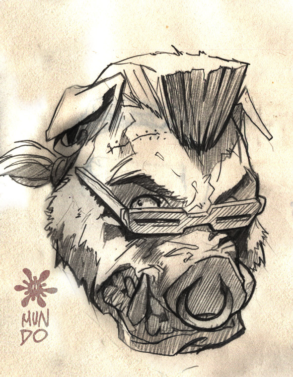
If you’re wondering this is what I’d want, in color.

This is what the character looks like in color.

So there’d be tan, purple, black, and gold for the septum ring.
Could this work next to a black and grey tattoo, or would I be better off putting it somewhere else on my body?
Another option I thought of is getting it in mostly black and grey, but coloring in his purple mohawk & glasses, and coloring in the septum ring yellow and putting it by my Jason mask/Freddy glove tattoo. That way I’d have two black and grey tattoos with a bit of color splashed in making them mesh together better instead of one being mostly black and grey and the other being full color.
What do you guys think?
I see no problem. Yes, make sure you get the right artist.
Put beebop on one calf and rock steady on the other.
No problem at all. If its a good placement, any color will work.
Agreed! I’m all for mixing it up if that’s what you want. Just make it good! 😀
You already know to get the right tattooist, right? 😎 Good..now…it’ll certainly work for sure. What I would do if I was you, I wouldn’t go with the cartoonish color pallet and not make your piece bright so to speak. I’d go with a more muted, darker style to the purple, tan, red, etc and allow that to naturally blend in with your black and white tattoos, which will work since you already have red in your Freddy/Jason piece. So if you were to go color, suggest a more muted ink approach to these colors other than full blown brightness and that should counterbalance the black and white and not stick out so much as it would with brighter color pallets.
@NeverBSatisfied 138632 wrote:
I’d go with a more muted, darker style to the purple, tan, red, etc
I was actually thinking the same, but couldn’t put it in words.
So.. what he said! 😀
That sketch lends it self to be really cool, but the cartoony color scheme might ruin it.
As for the placement, if I put it on my inner bicep should I “flip” the image so that when I stretch my arms out, Bebop would be facing right side up? Or place it like my other two? I feel like if I do it like the other two in that particular spot it’ll be hard to see/tell what it is.
You must be logged in to create new topics.


