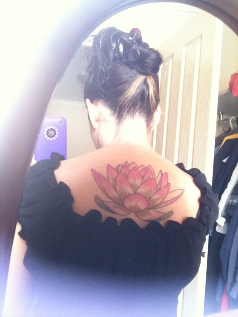
Hi there, I’m new here. I got a tattoo recently. I love it! Thought it might look better with more colour but still love it 🙂 I’m curious, what are tour thoughts. Thx
http://i255.photobucket.com/albums/hh122/nicky210473/IMG_08242.jpg
Hi and welcome to the forum 🙂
I really like the tattoo, It’s nice and bright color’d and look’s well done congrats on your first 🙂
having no background and being lighter and some neutral colors just doesnt make this on stand out.
But it is hard to see in this picture………………..based on what we can see, needs background and you could have requested more heavy coloring, I would have

Hi Nicky
It looks a bit plain. From that pic it’s hard to tell much though.
Congrats on the tattoo
Thanks for your replies, one of my close friends said it needs more colour and highlighting, I bc its my first I wasn’t sure what to expect, a fresh tatt always looks more intense and the colour more vivid. The artist showed me 3 pinks, I told her to go the brightest I really want it to stand out. I think I need to go back… It’s nice to know how ppl here appreciate it. I know this is a place for ppl that appreciate and or have tarts but omg! The amt of narrow minded ppl that tell me it’s awful! Cover it! Or it’s hideous! Really I don’t care bc it’s for me it has meaning and I’m really happy with it but u just feel like telling the judgemental f/wits to pi** off!
Tarts!! Haha my autospell kicked in that was meant to be tatts
I think it’s a great start congrats, You have plenty of room on your back to add to it and make it a center piece.
Hi and welcome to the forum. Your tattoo looks very pretty. Congrats! :):)
Looks like solid work. Congrats!
I can’t see how anyone could say that it’s awful or hideous.. it’s neither of those things.
That picture, however, does it no favors. It’s all dull and bleeched out and lacking in color. I would definitely recommend getting a real picture of it that actually shows off the colors 🙂
I love how big it is. It looks great. Please don’t add anymore to it. Less is more.
From what I can tell by that pic it looks good to me, nice clean simple design, congrats.
true that amok……….nice clean simple, but she sounds like she doesnt like it, or it doesnt meet her expectations. It is a nice piece, big, clean lines, you could leave it no problem
but if it doesnt please you, you may want to talk to your artist about adding some items, maybe fully coloring the petals and some light background………you know if it is not the way you want, get it the way you want
but dont let anyone beat you up, its a nice piece for sure
http://i255.photobucket.com/albums/hh122/nicky210473/IMG_08242.jpg
Hello and welcome to the forums, I’m quite new myself and this will be my first post now. I saw you asking a bits about your tattoo, definitely looks great. Plan on doing much more with your back? I see you’ve placed this up top, like the pink a lot as well. If you ever do put some background shading on it purple would really punch it out nice I think, if you’re into that color. Either way it looks great, well centered it seems in the photo.
I like it. You’re getting two different schools of thought here, one that likes it as is, one that thinks it needs to be more vivid.
If it were mine, I’d probably want more vivid also – but there really isn’t anything wrong with it as-is.
I’m planning a very similar tatt as my next, but on the nape of my neck and thus obviously smaller. Not sure what color(s) I want yet.
You must be logged in to create new topics.

