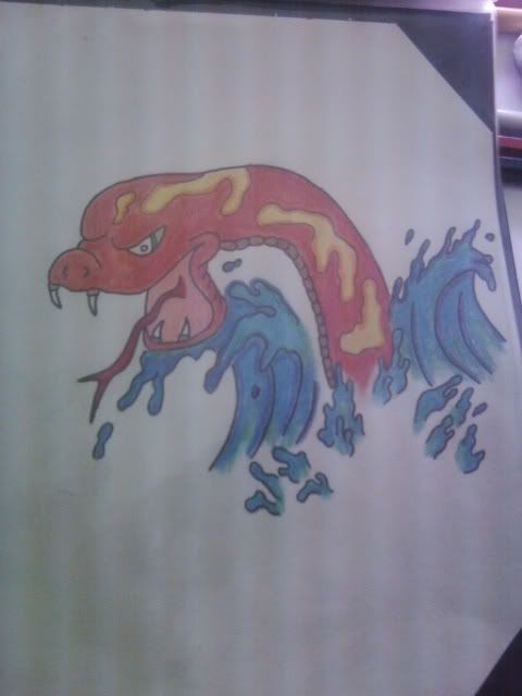
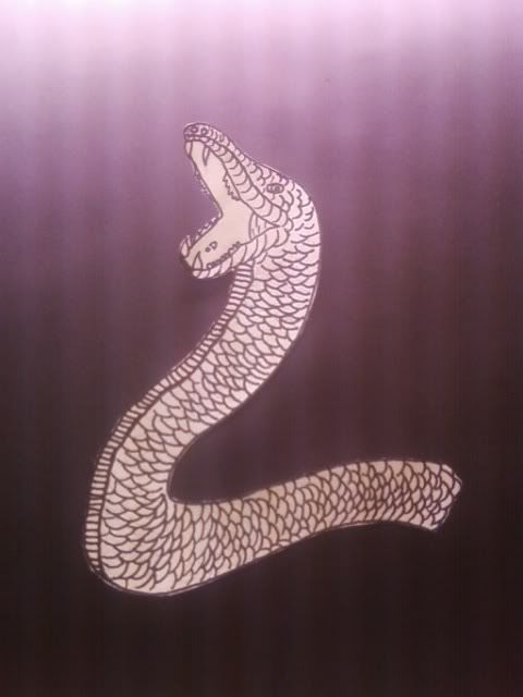
did this one real quick… my colouring has failed me yet again i think…
let me know what you think and how i can go about improving it….
http://i194.photobucket.com/albums/z153/bobbieboy91/Photo0093-1.jpg
image quialit isnt the greatest… using phone camera…
Hey Tattman
Your drawing is really coming on!
I would make a couple of small suggestions;
You need to define the mouth slightly more – from that angle it needs a bit more fleshing out.
The colouring – I know you are after that shimmering effect where the shading and colouring makes it look like the light is bouncing across the scales.
That is why I wussed out on art – I just did not have the patience. 🙂
That said try using a variety of colours that are near the same shade but are gradually light to dark. The take some paper and get get a simple object square etc.
1. First square divide into blocks and deep shade each section so it looks blocky.
2. Second paper use the colours to shade and each section but over lap each other by about a 1/3 – this will show how they mix on gradient scale.
3. Third paper – go wild fill the whole square in using light shadings of shadow and light with all the colours so it is mixed up.
Then when you keep it as reference it may help you picture the shading of a predominatly same colur piece in the future.
I can see near the edges (top fins) you have applied more pressure but it seems all to be the same height.
Don’t be frightened to try different shading techniques so it looks less uniform – fish have a lot of shade variation in their scales.
Damn fine piece tho!
Keep at it – I love seeing your work.
Take care
Matthew
thank you a heap mathew… im glad you like it… im finding my drawing is getting much better… i have some more sketches i shall add to this topic for you to critique…
i will infact give the shading squares a try and see how i go… thank you soo much….
one day you will have to show me some of your own work… doesnt neccissarily ahve to be a drawing….
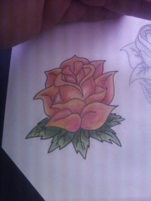
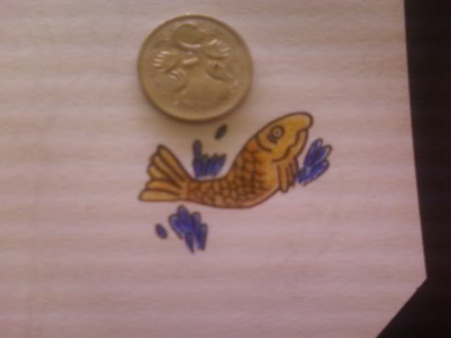
needed a .2 fine liner for this bugger… he is soo cute….
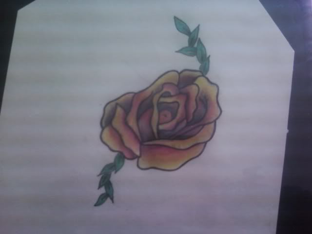
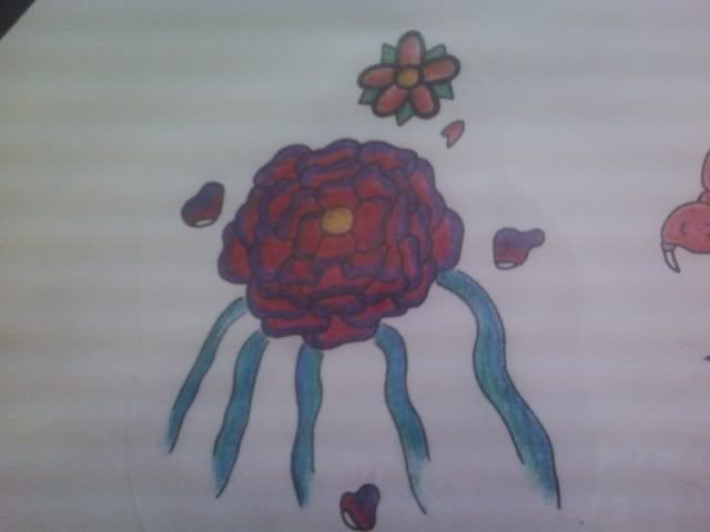
colours dont really contrast all that well… to dark in my opinion…
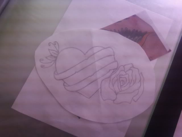
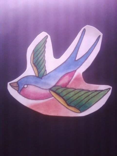
unfinished peice for my girlfreinds back… the pink and blue swallow you see in my previous post has a twin… each are to be tattood onto her shoulders (one per shoulder) and the heart is to be put on her mid back…. witht he words mum and dad int he scroll… these are not the good coppies so some minor adjustments have to be done to the birds first…. let me know what you think….
Hi Tattman
More than happy to look over your work – but just heading out with the wife.
As for my own work when I was 20 I was in a car accident that left me pretty much a cabbage and I as coma’d for 3 months.
I came out of it and I had to learn basic shit like how to read and write again, tie my shoelaces etc.
The Dr’s said all the knowledge was there I just had to learn how to access it again.
When I was growing up both my father and brother’s were keen artists and inisted I learn all the theory and practice everyday.
At best I was average. After the accident I am all on drawing a stickman.
The frustration was that I know the theory but to ‘relearn’ it all to get even back to an average skill level was just way too much work for me.
Besides I only did it to get some peace from the family as they were very pushy about it.
That is why I respect other ppl who enjoy it and want to do it – so no I do not have anything uptodate.
I might scan a few pieces from my old portfolio but that is stuff from 12 years ago easily.
Take Care
Matthew
anybody willing to critique my work?
Hi!
Ok, so firstly, I would suggest owning every tattoo magazine that comes out every month, 2 months, and quarterly. Study the shit out of them, if thats the art you are going for…
Dedicate your every waking second to analyzing everything…look out your window and memorize how the light from the sun reflects off of the first leaf you can see. Take nature walks and experience every flower, every rock, every leaf, every animal…Now look at the picture in the magazines, look at the tattoo pictures on the interwebzone, pick a couple artists who’s work you really, really like (my current inspirations are nikko hurtado, mike devries, jeff johnson, jess yen, alex pardee, and the handful of japanese masters) and follow them, look and study carefully what they do and try and visualize how they do it…
and draw…
draw an hour in the morning, on lunch breaks, and an hour in the evening or before bed….they dont have to be well thought out works of art, just sketches on what you see. This will help your drawing abilities…and so will living and bonding with your sketchbook. (and I do recommend a sketchbook as opposed to loose leaf, unless you have your own studio)
Secondly…
Remember being a kid and going to the store with your mom, begging her for that G.I. Joe coloring book (or transformers or go bots or ninja turtles or whatever…), getting it, and going home and trashing it….coloring out of the lines and making their faces purple? Its time to make your own coloring book.
If you look on the zonewebinterface, depending on what search engine you use (i google) you can find a myriad of outlines for your coloring pleasure. example: skull outline, skull outline drawing…
Get yourself some basic colored pencils and just have at it…when you are more comfortable, step up to a basic set of prismacolor premier pencils. (hint: when you step up with tools, step down with what you are working on. eg: dont work on a 11×20″ dragon with your new colors, instead, work on some smaller stuff first to get a feel for your new tools)
when the pressure of the linework is taken of your shoulders, what you are working on takes on a whole new life.
oh yah…
pick up drawing on the right side of the brain and any bargain book on how to draw…they help…
i think thats about the best advice I can give without giving away everything ive aquired over 25 years of drawing…I hope it helps.
fantastic pieces of advice there from DropScience,
your drawings are coming along quite well, although attention to symetry is letting you down..
do you have a light box???? if so then use it alot, get use to tracing the pieces and then your mind wil start to remember the basic geometry of things.
i was looking at the swallow…… instantly one thing popped out… take a look at the wings
they are different from each other, one has a rounded leading edge and the other is square, its small things like that you need to pay a little more attention to if your going to be serious about drawing tattoos.
for shading, go to the local cheap store where they do colouring stuff for kids, normally they have cheap watercolour pencils…. they are great for practice work. you can blend them colours nicely with a small soft paintbrush and a little bit of water.
i normally recommend picking up a kiddies colouring book for practice, you can shade and colour the pictures to look 3D or as realistic as a pixar pictures movie screen shot … it sounds silly but its great practice.
and remember that when you take the step up to prisma color pencils, they aint cheap………. i use rowney derwent ones
i think your doing really well, keep it up 😉
Thanks…a collective of advice given to me over the years…other parts are things ive developed myself, having taught myself everything I know about tattooing, art, drawing, etc.
not to say I havent had mentors, just none with the experience deserving of the title of ‘mentor’ or ‘master’…
and to the tattman…
just keep it up…no one is a master over night, hell even I need work…but the day I stop learning is the day I take my last breath. Nothing is perfect, nothing ever will be perfect, but in that search for perfection we find our true selves, unless of course, we are absorbed completely by our search and let it consume us (and in that case we become psychotic animals hell bent on our own self destruction)
Man, I need to get my work up here, maybe then Ill get some ACTUAL opinions…
thank you very much DropScience.
i have on count 30 tattoo magazines from the recent 12 months…
i have been buying them religiously every week or two….
i do not have a studio unfortunatly… i have many sketch books. these images were in a port folio i was making for one of my classes at school.. hence forth the loose leaf…. i had torn the paper out of my book…
as for i have got a few different brands… i started with the scribbles pencils but found they did not blend all that well.
i have a 72 set of derwents to go nicley.. i have had them for awhile now.. still goiing strong..
i also have some prismacolour premiers…. im in love with them but they are extremley soft and i cringe at the thought of dropping them….
i shall be investing in some colouring books. my brother and sister have many so i will soon go for a dive in the stack of torn up scribbles books in search for an undestroyed picture…. wish me luck….
Outlaw: i have not yet got a light box… instead i have been using the one at school… i have been using tracing paper also… i was aware that the wing was not exactly right…. before my girl freind goes in for her ink i shall re sketch it and do it again perfectly….
i shall even send you a link to it for critiqueing…
thank you both for your input…much appreciated…
You must be logged in to create new topics.

