So I have set myself a challenge for the duration of my first project this year. Over the next 14 weeks I will produce one tattoo design a week in order to keep up my drawing/painting practices and encourage creative thinking. I have set out three jars that each contain an element that I consider important to tattoo design; colour, position on the body and the subject matter. Each week I will pick one of each element from the jars and create a work that incorporates those three things.
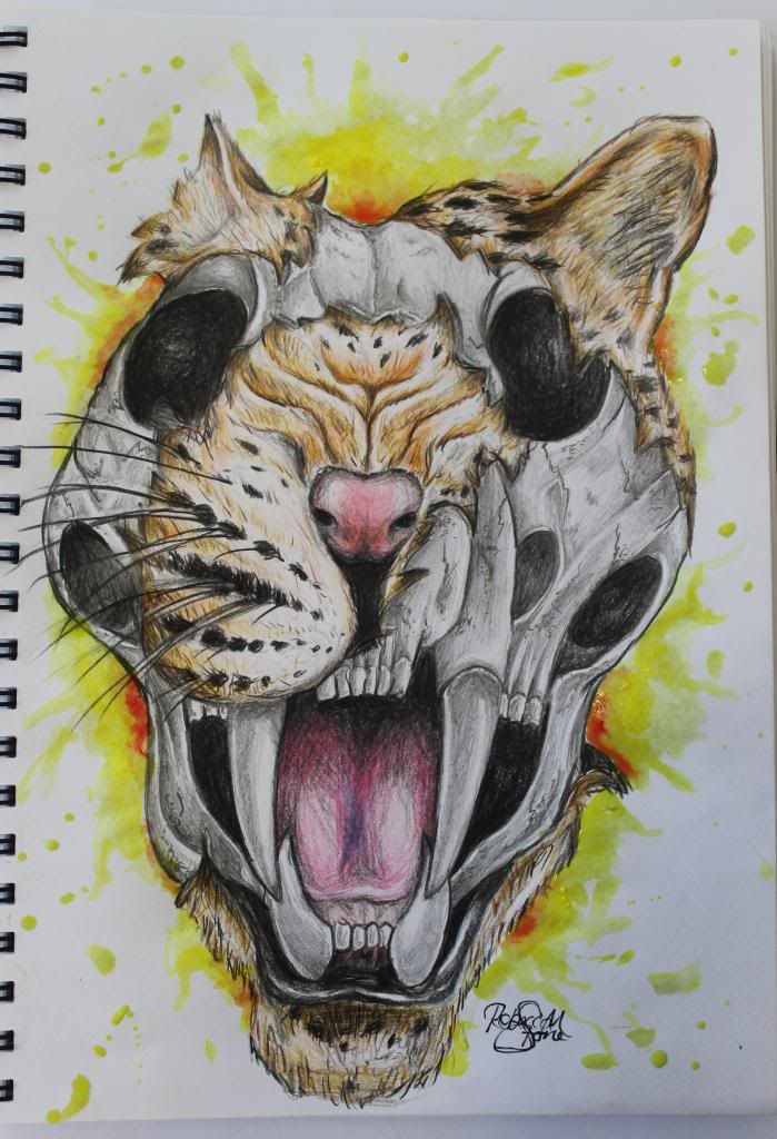
This is my design for week 2-
Subject matter: Leopard
Position on body: Right shoulder
Colour: Yellow
I have been looking at Gene Coffey as an artist model and my design was influenced by his work.
Keep it simple.
As Jerry said you are drawing way over your skill level
Agreed with the last comments. Far above your skill level at this time, keep it simple, learn about decay and anatomy if you want to draw things like this.
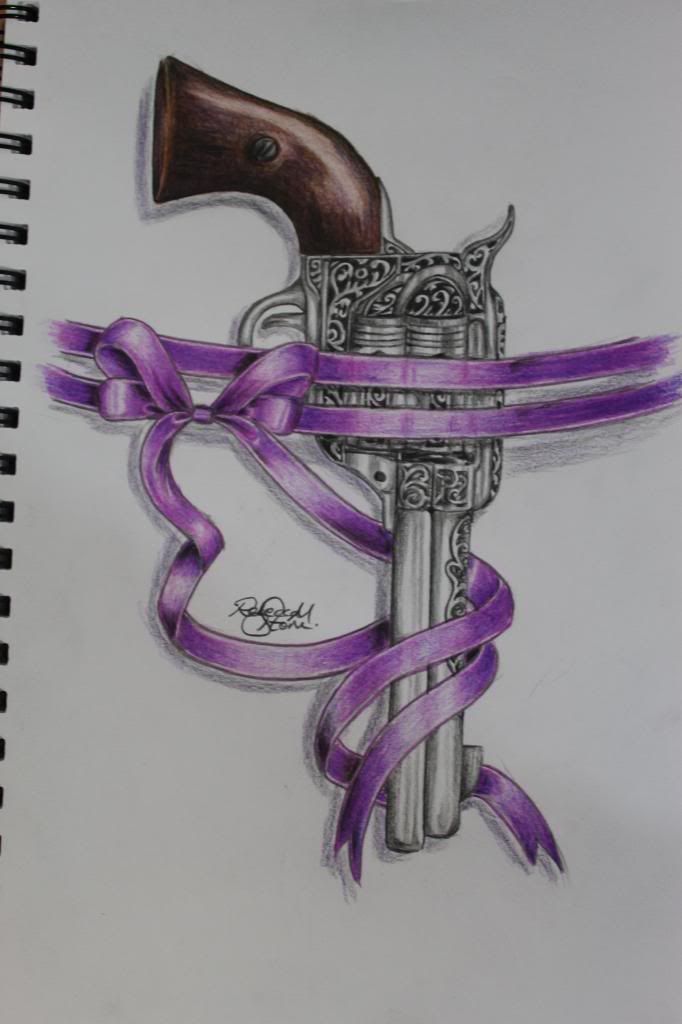
As you already know that your shadow is off remember your light source.
The scale is off the receiver is way to big foe the hand grip and the barrel, You would have to hold it with two fingers.
Other wise better than the pic before
The trigger looks odd.
But that’s probably all in my head.
I was thinking of pie. It must have a hair trigger.
I know nothing about drawing so I will just post to up my post count 🙂
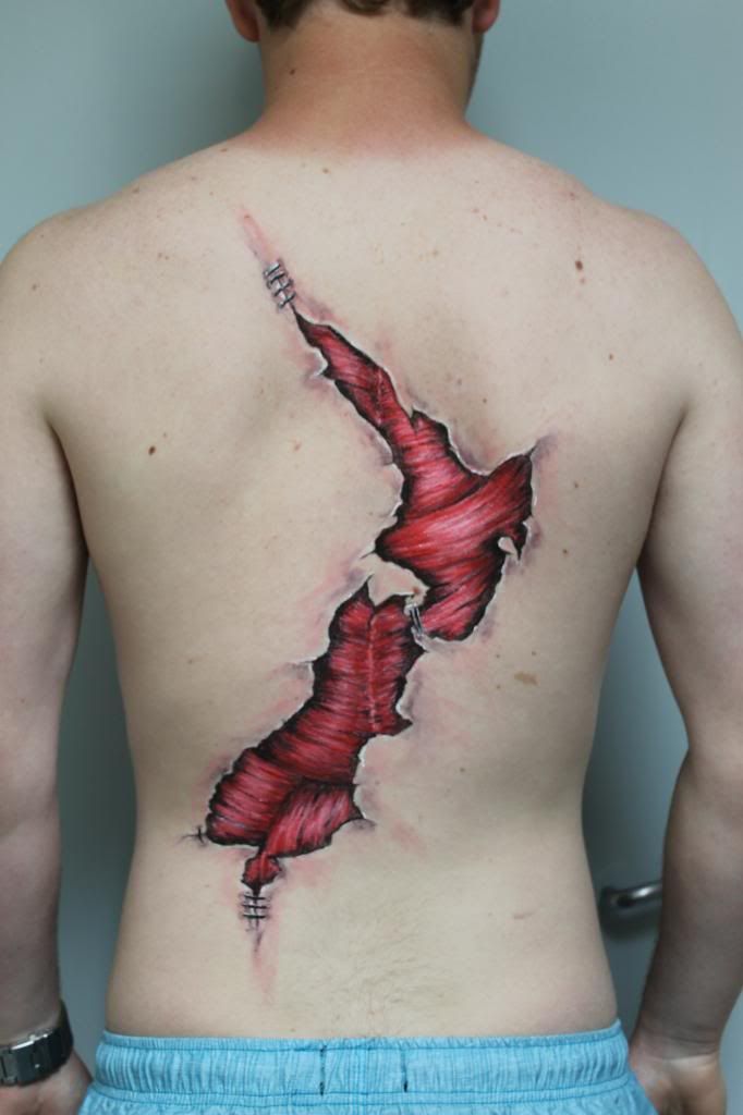
Thanks for the crit on the gun. Now someones said I can see clearly how out of proportion that handle is. This one I did with cheap face paint on a friend, just to play around with the idea. It’s the basic shape of New Zealand. . .refreshing to get good honest critique, only way to learn, so fire away 🙂
I like it.
I have no idea if they are or not but are the muscles anatomically correct for their location?
Sweet. I did study the muscle structure for this but if I was to paint it again I would add the white part over the spine and I think the bottom part isnt quite right. The top definitely is though.
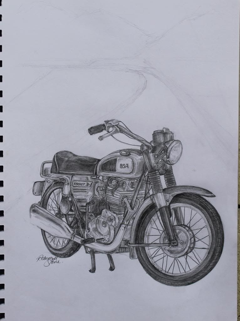
Looking for some advice for the background of this. Tried to get proportion better on this drawing but wondering what would be best to put in the background if this was going to be a full grey scale back piece? My first thought was open road and ranges but I’d love to discuss something more creative.

I think an old motorcycle garage scene would be cool, Something like this

I wouldn’t clutter it up with a busy background there’s enough going on with the bike itself.
I like this one the most. But I’m biased cause I own a few.
You must be logged in to create new topics.


