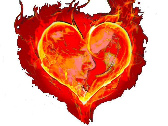
I created this design for my next tattoo which I call “Fireheart” with my wifes side profile in the heart.

It’s going to look bad from a distance…. uh, and up close.
Thanks for the input and opinions, this is why I ask.
Better safe than sorry. 🙂
The tattoo needs more lines and shading to look like something.
The tattoo needs more lines and shading to look like something.
Thanks, going back to square one with some other options.
I think if u showed a good tattooo that image, they can make it tattooable. Of course it wont be exactly like that tho.
The concept is brilliant on paper, though. I’m liking that a lot.
I think it’s a good idea, but there seems to be too much going on with it as it is.
Oh I’m sure it could be tattooed and done well it will look great for a year. After that it will turn into a giant red blob.
I don’t know about this one now either, as I have tried to invert colors, scetch etc and I just can’t get the definition I want from the pic of my wife inside the heart. I appreciate you feed back and advice on this, as better experience from you guy’s is worth a lot.
I have several other options for today, and one I’m giving my artist to work on for inking later.
Sometimes a simple design is alot better. All the red and fire kind of ruins the image. I’m sure your artist can fix up a design from your original design. I’m thinking black & grey would look alot better than full color. That’s just my opinion.
I still think it could be done well as long as the face isnt as opaque as the drawing and/or use outlines and stuff for the face. I am no expert tho.
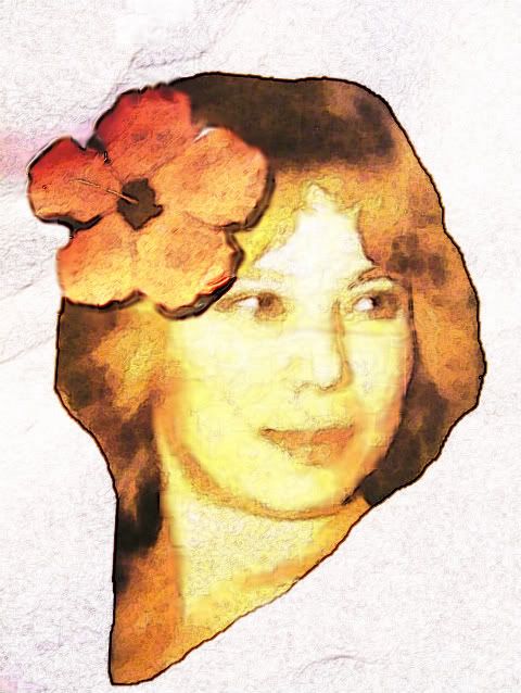
Here is another style of my wife that surprizingly my wife loves, as she actually doesn’t like tattoo’s 😀 I started to show her what I was trying to create, and she started giving her input with a big thumbs up when I showed her this picture with a Hawaiian hibiscus flower which is her favorite flower.

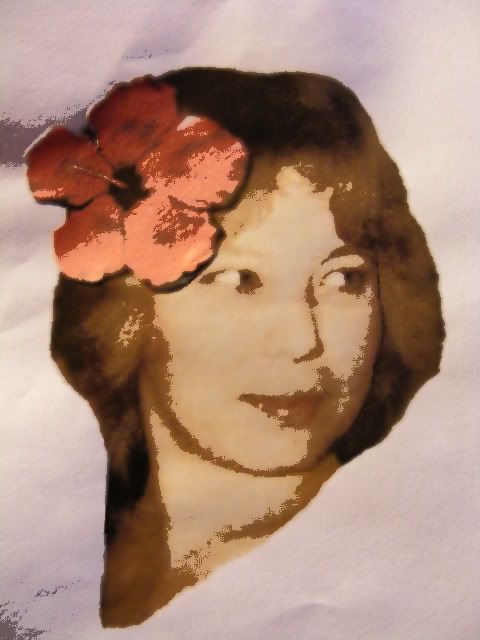
Or this

That’s a much better image for your tattoo and something both of you would be very proud of.
You must be logged in to create new topics.

