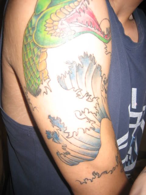
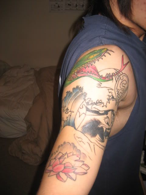
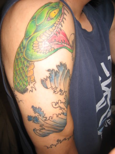
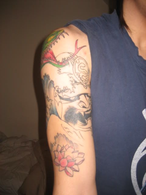
Hi guys, im new here ..hope you guys could give me some advise for my half sleeve that i designed 🙂


Nice collection.
Really like the gun on your side.
What inspired that piece?
Really like the gun on your side.
What inspired that piece?
thanks, ermm i had the gun/wing so that it could remind me to think Happy thoughts!!
it says on the gun ..
what do you think of the sleeve …does it look right ? do you reckon it would look better if theres like shading around the whole sleeve ? 🙂
The half-sleeve looks plain/flat.
I can’t really put my finger on it just yet but the waves/water and that mask or dragon [whatever it is lol] needs something added to it for sure.
I can’t really put my finger on it just yet but the waves/water and that mask or dragon [whatever it is lol] needs something added to it for sure.
ohh ..that aint good ..any suggestion that it could make it not plainflat ?
yeah i aint completely finish yet ..:/ its like kinda doin my heading !! want it to be finish asap 🙂
I agree with the gun, looks cool.
My suggestion for the sleeve would be to add some texture to the top of the breaking waves so they look like they’re splashing a bit more, and maybe some traditional japanese smoke around the snakes head.
My suggestion for the sleeve would be to add some texture to the top of the breaking waves so they look like they’re splashing a bit more, and maybe some traditional japanese smoke around the snakes head.
thanks bro,
what do you mean by the texture ? is it like shading you mean ?
what does traditional jap smoke look like ? 😛
Get way more shading and colour to it!! And you should really know the japanese style before you design something in it yourself… :p But yeah, japanese smoke(google it), more texture to the waves(shading and colour). Definatly get texture for the top of the wave, now it looks like plain line work, as if you didn’t know what to do about it.
And yeah… it does look kinda flat. You need texture and shading to make it “pop” 🙂
If you get it more detailed, it will most def look way better. Looks halfway right now.
The gun was awsome, though. What gun is it? I’m getting a gun myself, just haven’t been able to figure out which one yet.. ;P
I’m going to agree with the above statements. Take a look at my album. I think if you incorporate some japanese wind bars and shading, it will really add to your current design
It’s gotta be a .44 Magnum 🙂
your arm tattoo looks very plain, need an pro to think of a way of filling it a bit.
Wind bar that baby up, amigo!!! And find an artist who has the ability to use light and shade to emphasize depth.
It all kinda looks separated… like the waves and the snake and the dragon are all separate tattoos, it needs more flow i think. 🙂 but that’s just my opinion, i could be wrong…
You must be logged in to create new topics.


