Well after a serious amount of time looking and thinking today was the day I got my first tattoo.
Had my first session this morning, getting the outline and the black shading done. Heading back in a couple of weeks to get more done to it.
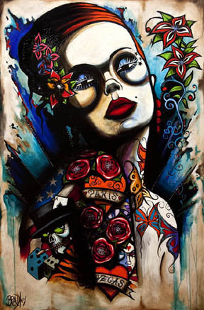
The inspiration behind the tattoo came from this piece of art.

It was altered slightly to suit me more and for the pruposes of tattooing (is there such a word) lol


Very hard to get a decent photograph of it, none of them do it justice!
Ill keep you posted as to the progress. In the mean time, let me know what you think
Cheers
It kind of looks like her face is melting, or she was punched a few times, or she’s stoned out of her mind.
There is something very off about the chin area, and her lips; it seems to just be completely misshapen. Her eyes seem closed and uneven.
Who is doing this tattoo?
I agree, The nose, lips, and chin look weird. The circle around her left eye(our right) is too big and doesn’t match the other.
I hope you picked a good artist and not some apprentice.
Please tell us who the artist is so we can avoid them.
Oh yeah, tuck your nutsack in before taking more photos.
But the circles are uneven on the picture as well, in fairness. It’s the shadows on her face, and no lighting is going to give you symmetrical shadows…
Yes, no lighting will give symmetrical shadows, but that doesn’t change that this tattoo was poorly executed and the girls face looks distorted because of it.
i agreaa… the face looks a bit deformed… and the eyes look like she’s suuuuper high ha
A perfect example where the artist tried to copy exactly the original artwork. Probably should have put their own spin on the work. What works on canvas doesn’t always work on skin.
I just can’t get over the LIPS – Bad bad bad
I agree with what was said above. It didn’t help that there is “package” edging into my vision on almost every photo.
I think art is subjective. The tattoo from the painting looks a little off, but nothing too distracting. Once color is done, it will be a whole different peice. Obviously you liked the original art. The question now is, are YOU happy with the tattoo? That is the only thing that matters. There are WAY too many haters on here to forget that.
lol, if everything in life was symetrical, the world would be a boring place.
you are looking at the shadows of the picture. once the colour is added the life will be breathed into it.
im very happy with what has been done, i dont want some straight edged, symetrical run of the mill thing that any chavtastic smicker will have. i enjoy art, and this piece captured a lot of what i wanted from a tattoo. the direction it is going in is perfect for what i am after.
cheers for the input though.
Hell ya man! Awesome.
I was actually thinking the same thing about the unsymetrical thing, it’s more ‘Picasso-like’ ya know? I dig it.
you are looking at the shadows of the picture. once the colour is added the life will be breathed into it.
im very happy with what has been done, i dont want some straight edged, symetrical run of the mill thing that any chavtastic smicker will have. i enjoy art, and this piece captured a lot of what i wanted from a tattoo. the direction it is going in is perfect for what i am after.
cheers for the input though.
Well, it’s good you’re still happy with it. That what matters the most.
And yes, it will look different with color, but I think it might still look off.
What artist are you using?
great original picture – poor tattoo ! – still if you’re happy with it – colour might improve it !
You must be logged in to create new topics.


