looks realy good mate.keep up the good work.
I say stick to the fat line work and concentrate on colors. Old skool all the way brother.
Very nice David! I wish the first thing I had done on someone else looked half that good! lol I’m jealous, so jealous. But I’m patient. I’ll get my apprenticeship soon, then we can compete! >D
You have some serious talent.
You said you’re in Buffalo, yeah? I have family real close to there. Next time I come up I may be hitting you up for an appointment or two. I’m really feeling the old school look on some of the pieces, and I am LOVING the vibrant colors in your roses. Definitely making me want one.
Good work.
Here are some more. I’ve been tattooing for just over a month now. I think I’m getting a bit better. Baby steps….
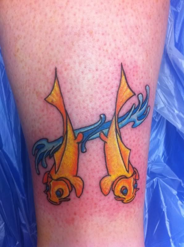
First sitting on this one.
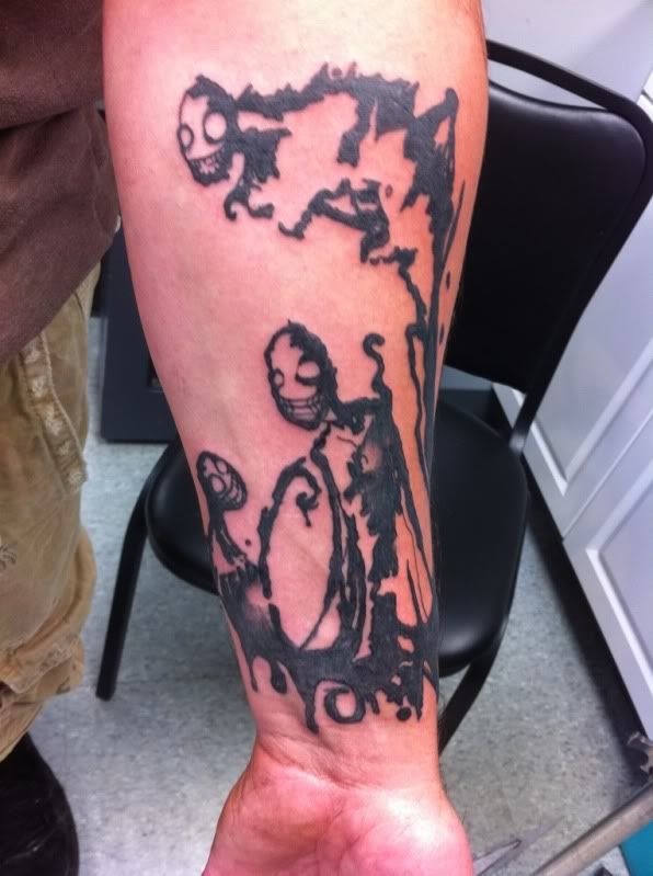
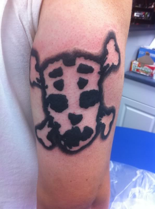
It’s not my design. It’s a band logo. Not what I would get as a tattoo, but the customer wanted it. He wanted the black to fade out around the edges. I thought it was executed rather well

Definitely improving. I think that the third one is badass. Great design. I also think the logo was well executed. A bit tough to judge a design if you are unfamiliar with the reference material. I noticed a little extra line in that last one. A little oops, perhaps?
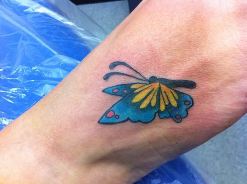
The lady flinched. It’s hard to keep people still for foot tattoos. I’m thinking that as it ages the lines should blend together a bit. If it doesn’t then I’ll fix it for her when I’m a full fledged tattoo artist.
It’s a good start. Keep working hard and you’ll keep progressing. Like those flowers though, eh?
Some more tattoos. Still learning.
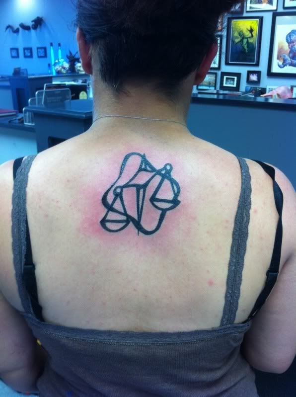
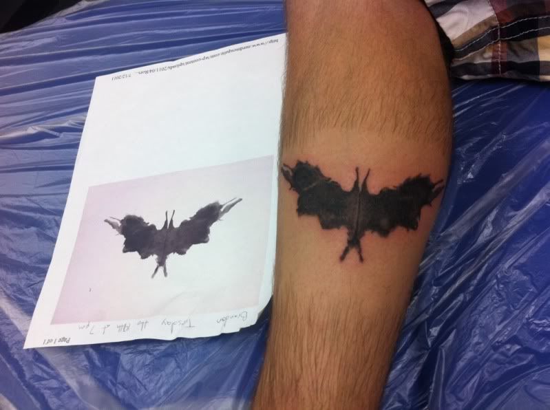
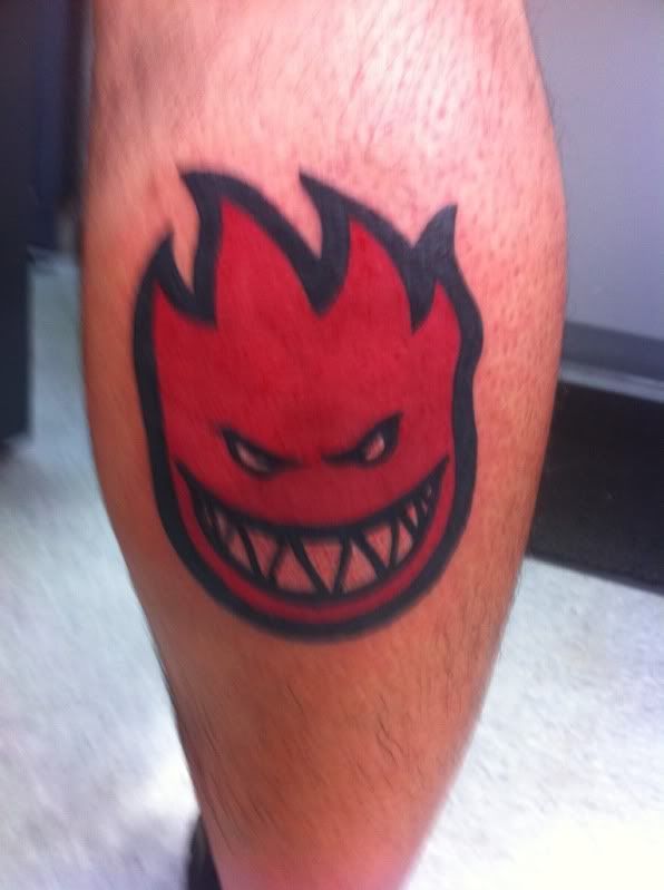
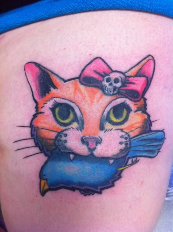
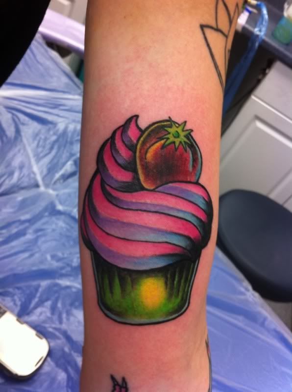
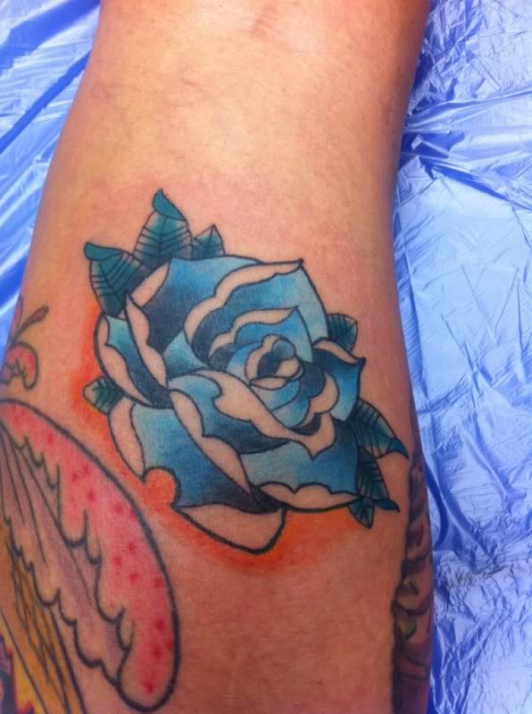
These are all freshly tattooed, so a lot of the white highlights aren’t showing up.
I really like the cupcake nicely done sir.
I like the pussy and the cupcake, but I’m hating the Libra design :confused:
You must be logged in to create new topics.


