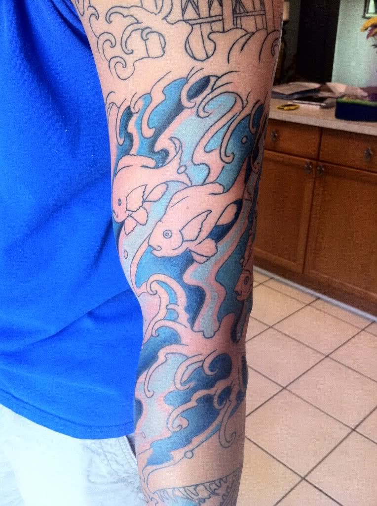
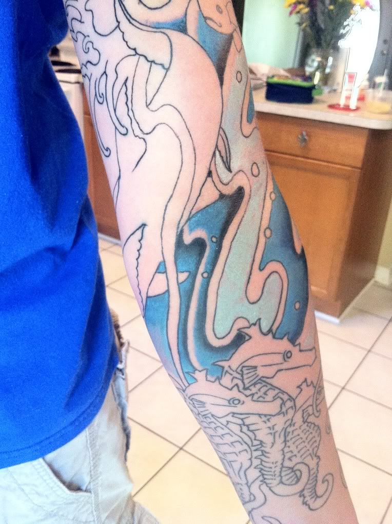
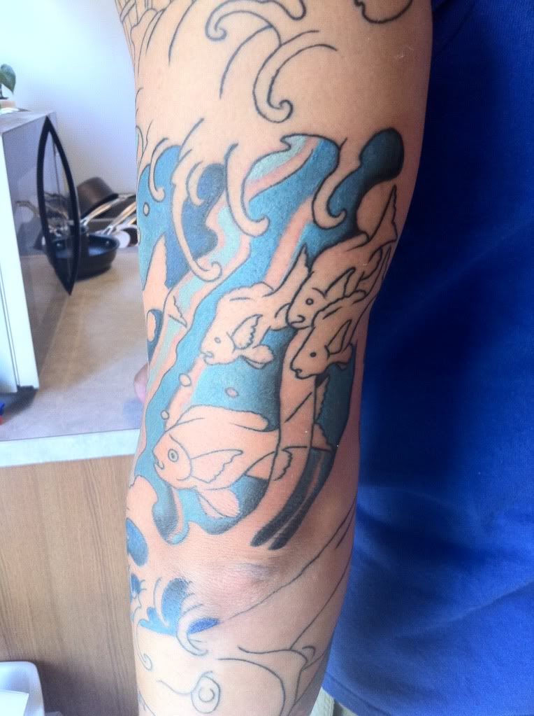
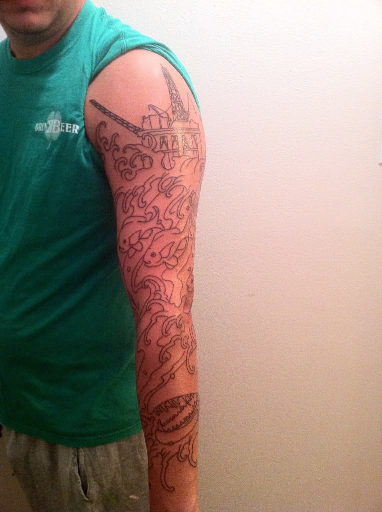
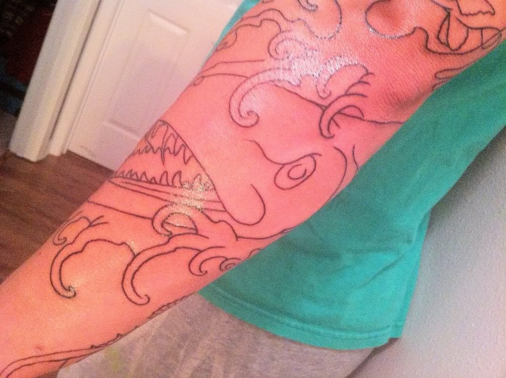
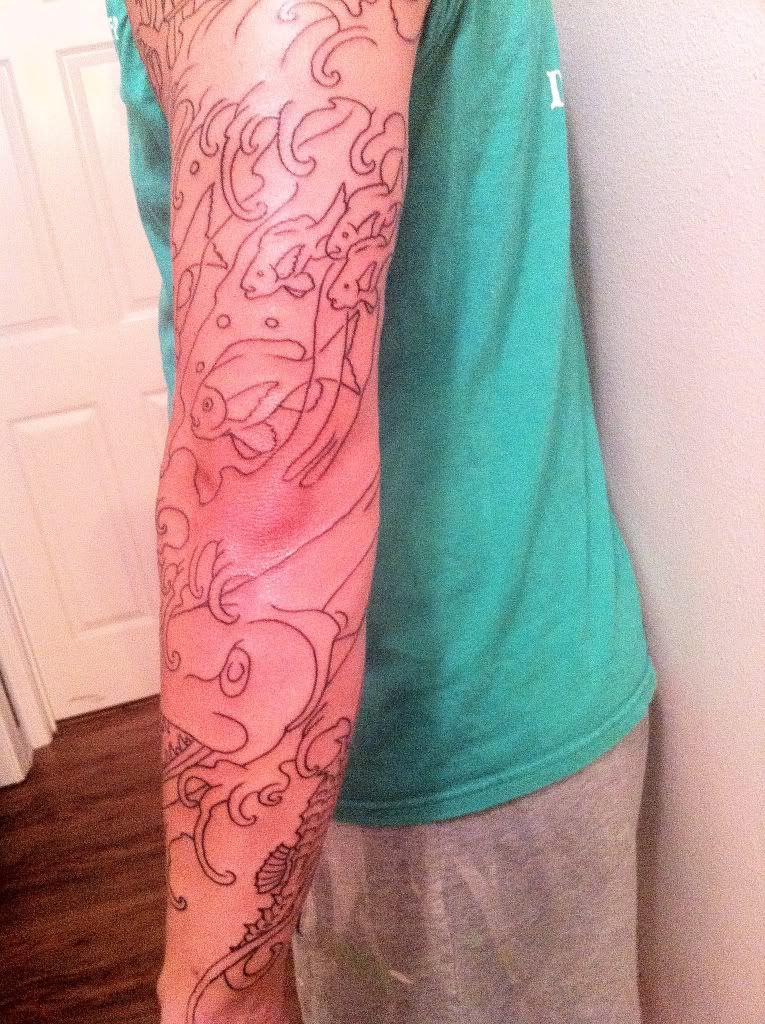
Went on the 4th to get my sleeve outlined. I am happy with the tattoo so far. I work offshore and wanted something to somewhat reflect my career. The three seahorses at the bottom are for my two kids and wife. Will go back in a month to start the color, and to also add coral down to my wrist. Let me know what yall think. I will get better pictures if these dont show that well.
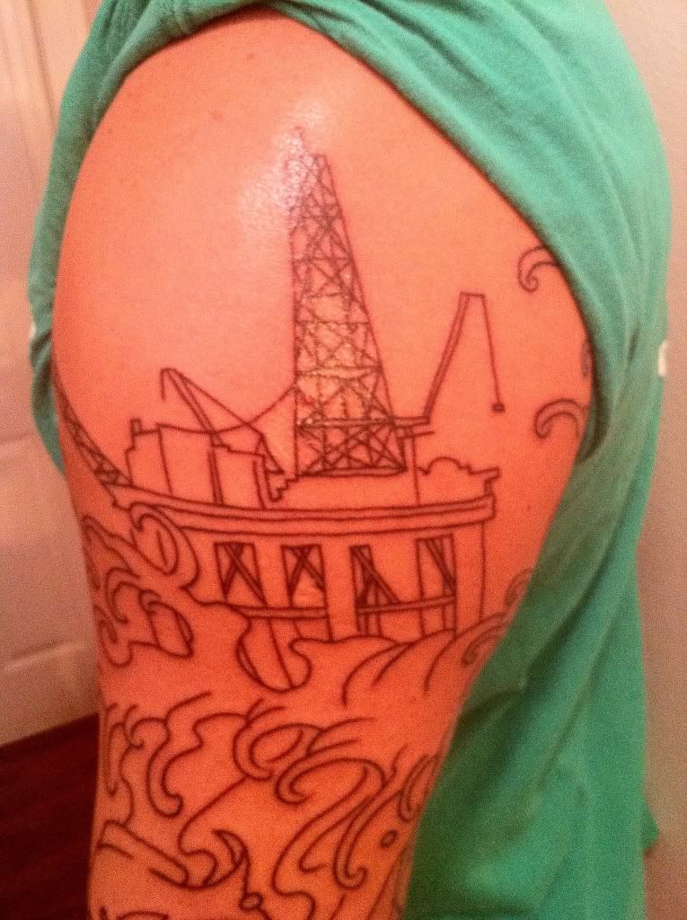
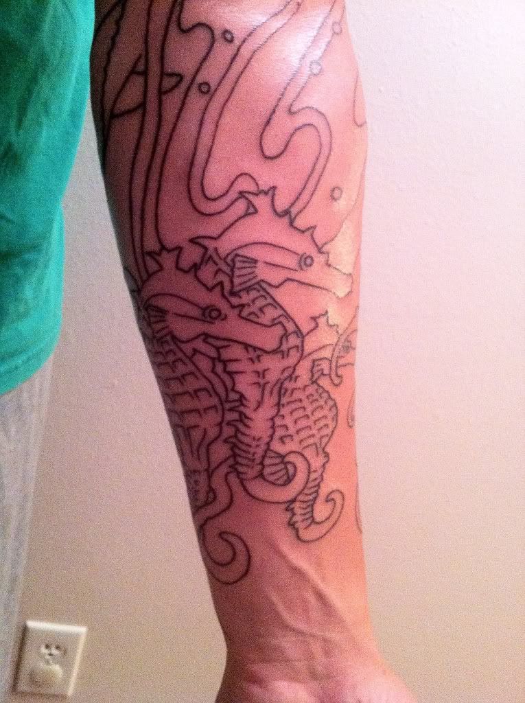
cool concept! some of the lines up top are wonky but the line work on the seahorse is really good!! cant wait to see it finished!
Yeah i did notice that the legs of the platform are a little off as they go lower, hopefully we can get it a little better looking with shading and coloring.
cool concept indeed… yeah i hope it looks less cartoony when its done… unless your going for that childs book illustration look?
No definitely not, the fish i am hoping definitely make a change for the more realistic once we have more than just outlines.
ok than yeah its gonna look nice! im supprised theres no koi fish there…. wow good job man!
HAHA as far as i know there are not any koi in the Gulf of Mexico, so figured best to keep them out. The artist has a strong influence and preference for Asian oriented tattoos which shows in the waves but I think its a great representation of what i wanted.
yeah man the waves are good. no ideas on the colors at all man? im curious on that big guy in the middle…. make that guy sinister as hell… he looks pretty wicked already tho
The outlining always looks a bit cartoon-ish, but once the shading comes in the picture I’m sure it’s going to be a rad piece
Line work is off a bit. I hope the coloring pulls it all together. Congrats on the ink
Um, wow, well, I hope you artist has big plans for this, because right now it’s very boring. I’m not judging, though. I’ll be interested to see how this progresses. I know from my personal experience as an artist that a work in progress is usually far different from the finished product. Welcome to the forum and good luck!
nice im usually not into color pieces but the blue is really gonna make everything else pop. i like so far and hopefully it keeps getting better with every session and congrats. keep us updated brosif
same what was said above. Congrats on the ink
You must be logged in to create new topics.

