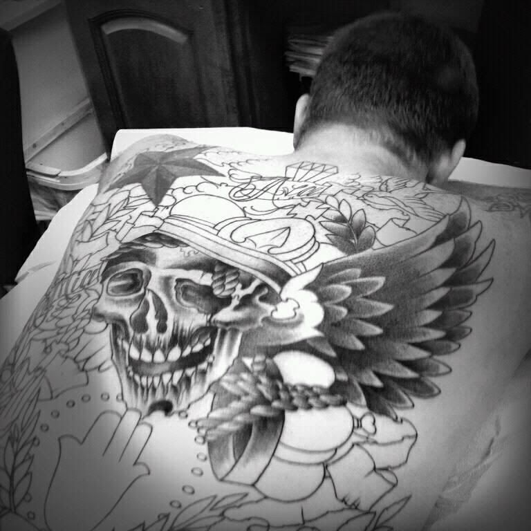
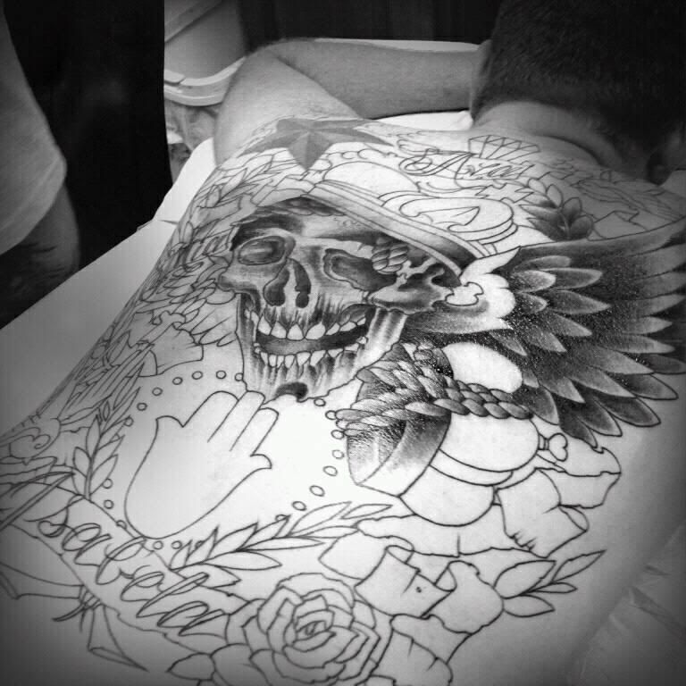
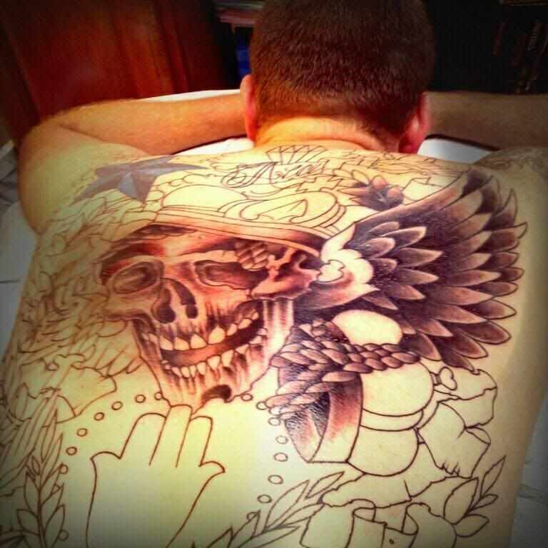
the star was my first tattoo. i had to work it in since it would not be able to be covered up.
wonky linework, poor composition, cant draw a skull which is the centerpiece, I apologize it is pretty rough, Id have a better artist take over
going in for my first round of color this weekend. Ill update the pictures then!
Here is my first session of shading, this was only a little over an hour of work.


Zoo, dat is een mooie backpiece, ben benieuwd hoe het eruit komt te zien als ie af :D:D:D
Wow you went all out. congrats man.
It’s looking awesome man!!! keep them pictures coming!
Ok, couple things about this piece. First, I don’t know what the artist is intending, but those teeth need some shading. They look VERY two-dimensional as is. Secondly, the septum has pretty much the same issue. Too definite a line between the cavity and the surface. Lastly, the angle of your pics suck, lol. Nobody is going to be standing at butt level looking up at this tat. Stand up and get a full on pic, man! All of this comes from an artist’s perspective. I’m sure the average Joe on the street would be floored by the quality of work. Money well spent.
You must be logged in to create new topics.

