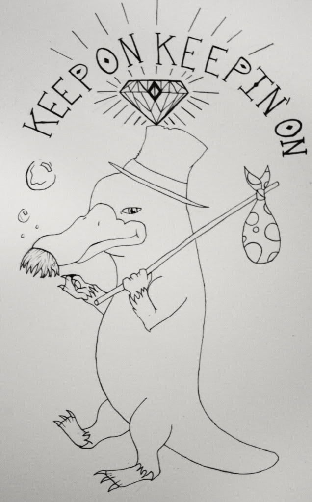
this is the line work I drew out for my next tattoo after I get color on my sloth august 17th.
any suggestions or critiques on my linework and how to improve the steadyness of my hand and my letters would be greatly appreciated seeing as I want to try to get an apprenticeship when I’m good enough.

the weirdness is the best part!
Lower the mustache, lose the diamond, add a bottle of booze in his hand and he needs a dog
i’m not a drinker so no booze and im going to switch the diamond for a light bulb like hes got a great idea i tried lowering the moustache in photoshop and didnt like it as much i also added bushy eyebrows and some scruff and some line weight i’ll put picture up later tonight. i started drawing in a dog and it just looked like an after though. Are my lines steady enough in your guys opinions?
i think you still have a ways to go on your work before you should try apprenticing but it cant hurt trying to go for it and ask around. i would like to see some of your other work to compare this to and maybe be able to help you out a lil more. keep practicing and draw everyday also watercolors are a great medium to use to help with the process of doing a tattoo( lines first then block in your lights and darks and the way you shade is similar).
I thought the bubbles where the animated burps of a drunk. maybe a corncob pipe.
nah buttwheat hes going to be underwater once I add color. and Clay I agree I have a ways to go but I’m going to MIAD for Illustration the next 4 years so that should help. and I already work in watercolors all the time I’ll upload some of my other work tomorrow thank you for your input. I do draw every day as it is but I need to find time to draw more. I’m thinking after college I’ll try for an apprenticeship but what would be some specific things to do to steady my hand or just improve my work in general?
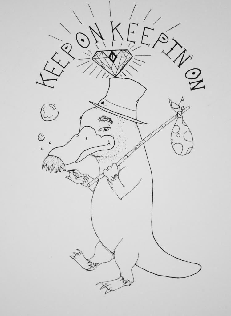
heres the improved linework

For me, it’s very poorly proportioned. You should, for instance, be seeing much less forehead and much more eye on the right side, unless his right eye is about 2″ further to the right of the beak than the left one and he’s suffering Elephant-Man syndrome. His feet are also different sizes. Basically it looks like it was drawn by a child, or someone (like myself) who can’t really draw.
Overall, it’s just a very poorly done drawing, but I accept the concept that might well just be your artistic style.
his feet are supposed to be different sizes because of depth perception and his right eye would be slightly visible but as i was drawing this out in pencil it looked weird with just a corner of an eye so i made it flatter and just gave a peak of his eyebrow.
haha it was supposed to be defensive i was just saying these things were thought out beforehand. I’m excited to add color to it
Art is always subjective. If you thought about it and planned it and designed it this way, it doesn’t matter that I think it’s horrible. That is the true beauty of the tattoo medium. It’s self-expressive art in it’s purest form, where the viewer doesn’t go into a museum to look at it, but the art comes walking up to the viewer and demands that they look, judge and feel.
i wouldnt worry about the eye not being shown because it will still come across as there and the feet should still b similar i size the depth is not that great apart where its a drastic size difference. as for steadying your hand i wouldget a ruler draw a line and keep practicing tracing that as straight as possible and other shapes. for years in an art college will definately help and its a good idea to wait until you graduate. im in my 5th yr majoring in Painting/Drawing and cant even begin to tell how much my work has improved so keep up with the work and you should b fine in 4-5 yrs, no need to rush into it.
exactly clay its an eventual dream i was just looking for input and I got that. thanks for the tip on steadying my lines because that is one thing i really need to improve. Where are you getting your degree?
You must be logged in to create new topics.

