August 31, 2011 at 1:25 pm
#37483


August 31, 2011 at 1:29 pm
#111241
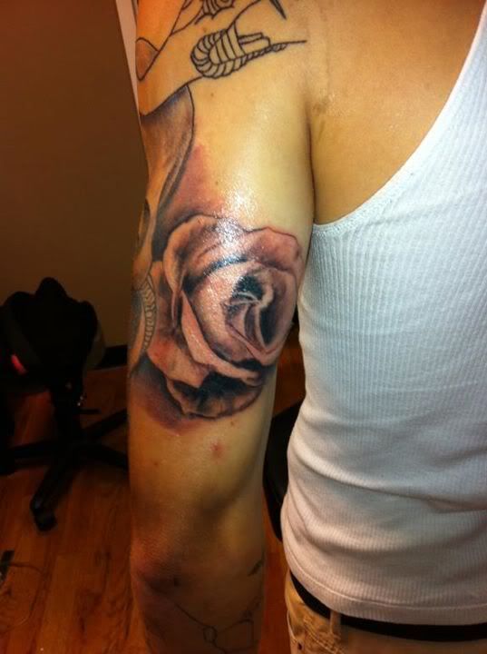
The rose is the shit dude.
Nice job
September 1, 2011 at 4:09 pm
#111321
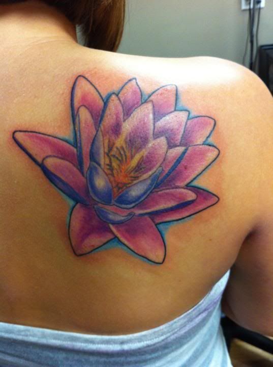
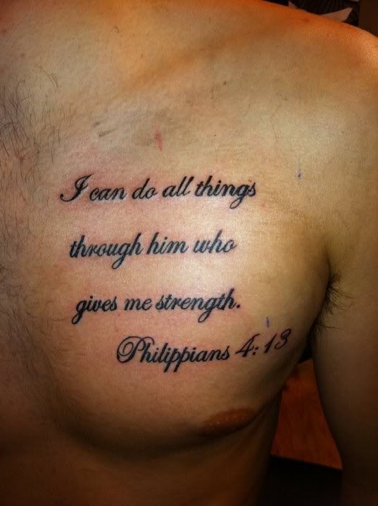
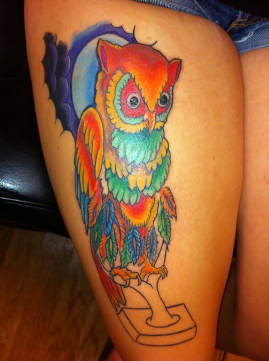
The rose definetly has the most artistic value. The lettering looks very clean. Nice. The owl I think needs more darks, just in the deepest corners so it stays bright. The lotus looks ok, but its not too smooth. If you were building a portfolio, i’d include everything but the lotus.
September 1, 2011 at 6:28 pm
#111327
Damn…..wish you could have done my roses tattoo…..
September 3, 2011 at 6:59 am
#111462
That rose is sexy forsure! Very nice. Your lettering and spacing is dead on too, very nice
September 5, 2011 at 2:26 am
#111643
Would love to see more pictures of that rose. It looks beautiful 🙂
Viewing 10 posts - 1 through 10 (of 10 total)
You must be logged in to create new topics.

