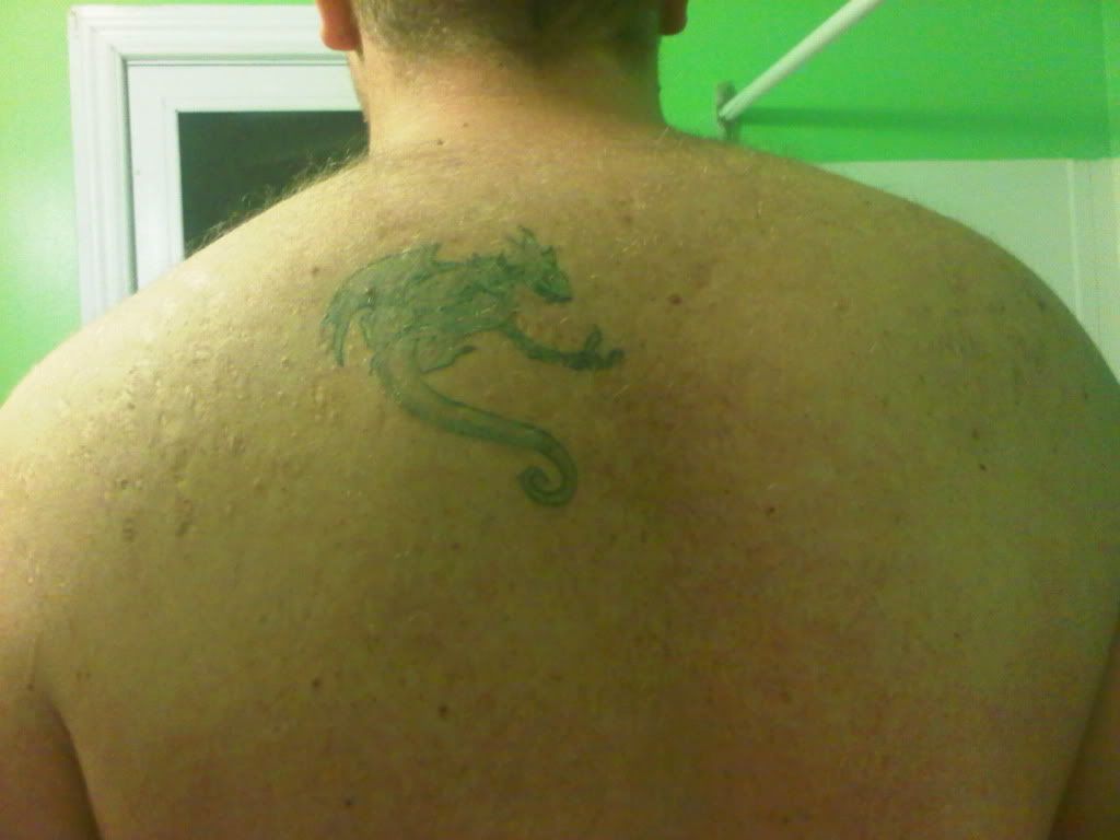
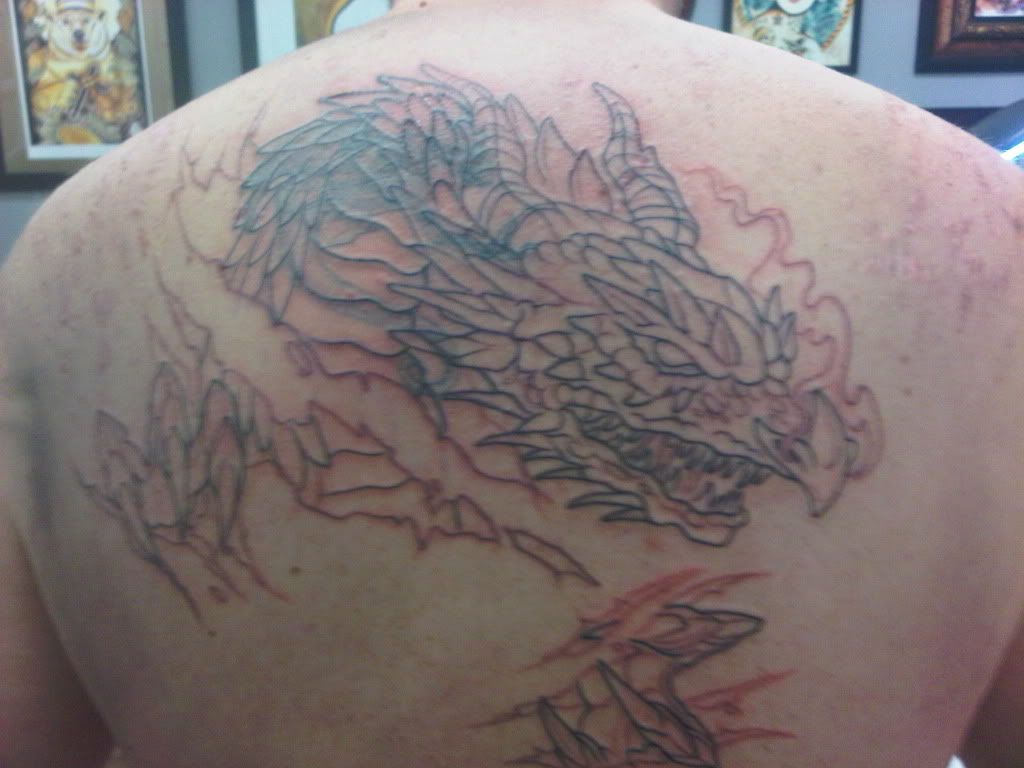
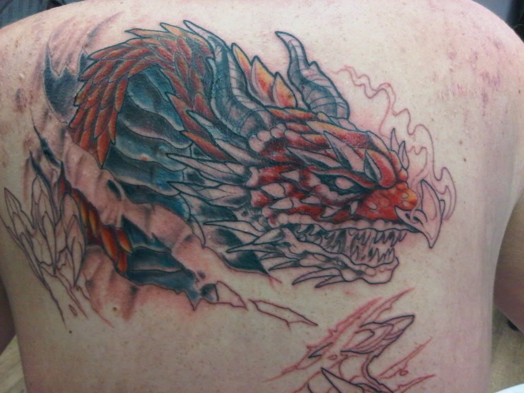
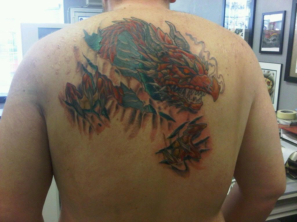
Hey folks, I posted this in the cover up sub-section. But I thought since it was finally done I would throw it here to. Basically I got a stupid tattoo years ago that I regretted soon after. I lived with it as it was on my back and didn’t see it. BUT the Urge came to get it covered. I got it done at Radium Tattoo (http://www.radiumtattoo.ca) Dan is a great guy and took care of me. On to the pics, I got it done over 2 sessions.
Original Mistake:(

outline over it

First Session

Done and Happy!

Hell dude, 100% improvement, that new ink is awesome too, congratulations
Nice. It covers it up well…and some 🙂
It obviously covers the preexisting tattoo well but to be honest overall I really don’t like the execution of the new piece. It doesn’t look poorly done but I think it seems a little flat and could have been better with more depth, especially in the skin tears.
i think that although it is definitely a VAST improvement on whatever it was supposed to be that was originally there, what makes it not quite right is the artist has used the same colours for the dragons belly and the the background colours behind it, which confuses the composition a little bit. It could have been pulled off a little bit better, BUT all in all its really not bad at all, its certainly eyecatching and a majority of people who see it will not have the critical eye of a bunch of collectors and so will only compare it to sir scratch-a-lot, which this guy certainly is not.
Perfectly polised, no, but perfectly decent, yes, definitely.
Congratulations 🙂
Whoah IMO that Dragon looks BAD ASS!
Thanks for the Feedback guys, I can see where your coming from about the background colors. We went this route rather then trying to mimic bone and muscle in the skin tears as we thought that would wash out the dragon. Either way im loads happier then what was back there before lol. 😀
Now I just have to say out of the shop for abit or I’ll find my self with a sleeve or two and a empty wallet:p
Wow, nice job ruining your old tattoo. I thought the original looked MUCH better. But then again, what do I know? I was ridiculed in another thread due to the fact that I’ve only had my tattoo for less than a month while 99% of the forum has had theirs for ten years or more. So, just ignore my opinion due to this. Yeah, do that.
are you actually insane!?
Nope.. just a troll.
A vast improvement. Definite upgrade. Good job!
Yep, my opinion varies from the norm on this forum so I’m both “insane” and a “troll”. I can’t wait until you guys call me “fat” next. At least that is true…
You must be logged in to create new topics.

