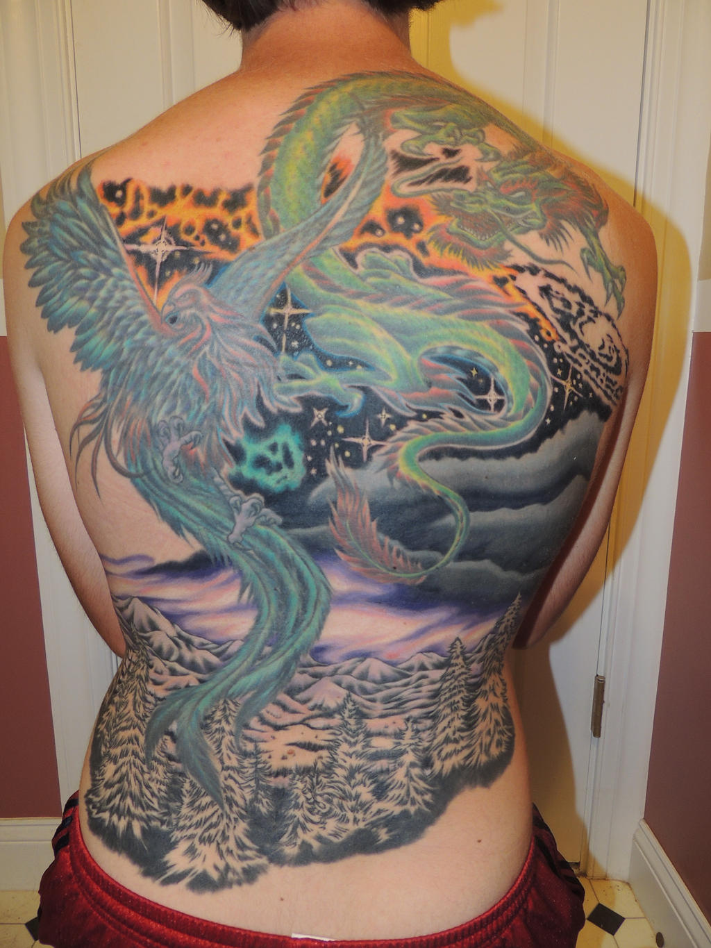
Its been about 4 years since I started, phoenix then dragon, but last fall I started again with the background. I can only book Sundays with my artist so it has taken a while since he books up fast. First picture is better, but before the two most recent sessions for coloring the galaxy and starting Hubble.
Its been a bit complicated to say the least, especially since I didn’t plan on a full back from the start. Opinions are appreciated, might give me ideas to make it better as we continue.


Very interesting.
I can’t say a whole lot considering my back.
To me it looks very blurry and faded already?
He said the Phoenix and dragon were done 4 years ago.
The yellow and black near the Phoenix remind me of leopard print.
The leopard print area you are talking about is the start of a nebula:

The easiest way to explain the background is that it represents the cycle of life on a cosmic scale. Eventually when its done it will have forms of all of the the stages of life:
Birth: the nebula
Life: the landscape, invader Zim in his voot cruiser eventually, and the hubble because its awesome and it took the reference pictures
Death: a dying star eventually (well not dying, we don’t want to see a good picture of a dying star so I’m using this one of a gas cloud)

And for bonus points you can easily compare the traditional phoenix story of rebirth from ashes to the birth of a nebula and subsequent solar systems from the ashes of a star when it explodes.
I don’t understand the dragon. Also, having the nebula and the phoenix together to represent the same thing seems a bit redundant. Maybe you could explain what inspired you to get this mix of things a little more?
I like it but I would definitely go over the Dragon and Phoenix again, crisp them up and make them visible.
You must be logged in to create new topics.

