Forum Replies Created
That picture aside, I have a different objection to the idea. There’s no real way to say this sugar-coated, so I guess I’ll have to be straight forward.
Having my daughters eyes staring at me when I’m doing my wife from behind would not only ruin the sex (perhaps even permanently) but it would become difficult to look at the daughter afterwards as well. Heck, just kissing the back of her neck would be horrible.
LMAO – he said the same thing! I have pretty long hair so it’d be covered most of the time BUT I do get what you’re saying.
If it were placed elsewhere would that make a difference or is it just too creepy to keep considering at all? Don’t worry – no offense taken either way, opinions are opinions. 😉
Turn the flash off and go to a well lit window that is not in direct sunlight. Turn her faces the the lint is off to one side. Play with the light, take a few photos at varying angles while trying to get the look right. Take like 50 photos, one will turn out good.
And yeah, I was thinking crayola style hand writing… I think that would really make the tat clear as to what it is.
What do you think of that?
I like that idea…might take some doing since my daughter is only 16 months and not the most coorperative, LMAO! I might dig around for a picture that catches the “sparkle” without the “flash” already and just ask my artist to render the look I posted above but detailed with the other, less ghoulish glimpse.
What do you think of the full quote vs. just the eyes vs. the eyes with only the words love and dream scripted above and below? I don’t need the meaning to be obvious since I enjoy explaining the meaning behind the two I have already but don’t want it to look completely random either.
The quote you pick will also make the tat- the font as well. I think it would be kind of cool to have it done in slightly bad hand writing, like a kid wrote it.
I’ll have to try taking the flash off and see what I can get. The kid handwriting is cool – like crayon scribble?
i think you should add the dot design around it as well.
if you look at my album, there’s a picture of me being tattooed by the artist and her arm has the dotted design im talking about.. but you do have to look closely haha
anyway hope it turns out great!
I can’t really see the dot design you mean…is there another reference so I can see the style you mean?
____________________
should i design my own tattoo
I’ve never done off the wall…I prefer to go in with my own design. My tramp stamp I drew completely myself (though not really unique ideas – twin dolphins with a fiery gemini symbol) and my tummy tat is a replica of a South American statue I have…the flowers were added by the artists suggestion.
for what it is worth, here is my take on it.
Firstly, I think the placement on the upper ribcage is great. Your tattooist will be able to place it just right ( not too far around to the side ) and it will look nice.
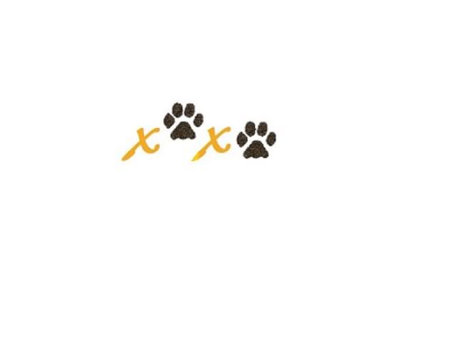
Secondly, for a splash of color, I would suggest that the “xoxo” is done with the paw prints as you originally wanted. I would, however, do them in a muddy black. I would then use a pastel orange behind it in the shape of a heart or a cross ( your preference ) and would, of course, NOT outline the background color. Just have it simply fade out where the outline would normally be.
Orange works well on the majority of people and you wouldn’t want it a solid orange anyway. Keep it soft and pastel and those who see it will probably need to look twice to recognize the heart (?) in the background. I believe this concept would suit your purpose and still look feminine.
Food for thought.
Hmmm, the heart background is interesting and I like the not outlining idea (I’m not Christian so don’t want the cross). When you say muddy black, are you referring to the smudgy ink-print style that I want or is that an actual color?
I was originally thinking a splash of color in the “x” part…should I just keep them black like the prints or will the prints stand out more if the “x”s are solid? Here’s a Paint Shop mock-up that I made kind of showing the basic idea of what I want.
2 1/2 more days left 😀

🙁 No takers, huh?
Ok, well I’ve decided to get the tattoo on the 27th of this month – the anniversary of his adoption – a day much more worthy of memorial rather than his passing. I’m pretty much set on the “xoxo” idea with paw prints for the “o” on the side of my ribs, but still need some ideas on coloring and if more should be added. I don’t want it too simple but maybe it’s fine the way it is. He was orange/black so I was thinking of doing the black paw prints with orange “x” but don’t want it to look Halloween-y (and I’m afraid orange won’t show well on my skin), if that makes sense.
Ideas?

